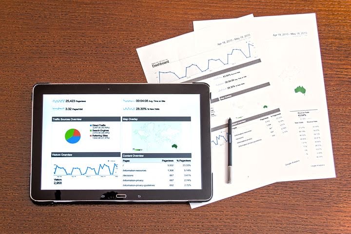
Check Sheet / Line Graph
Check sheets are simple yet powerful tools used to collect and organize data during investigations. Line graphs are excellent visual representations of data and are commonly used in investigations to analyze trends over time. In this course, we will delve into the comprehensive analysis of a line graph, and then extract its core elements through a brief overview.

Chapter 1: What is it?

Line graphs are a commonly used tool in data analysis and representation. They provide a visual representation of data, allowing us to understand trends, patterns, and relationships between different variables. Line graphs are particularly useful when analyzing data over a continuous period of time.
Chapter 2 : When do I use it?

Line graphs offer a multitude of possibilities for visualizing data and effectively communicating complex information. By understanding and leveraging their potential, you can elevate your visual communication skills and dominate data representation.
They are particularly useful when analyzing data over time or when comparing multiple sets of data. Line graphs simplify complex data and make it easier for researchers, analysts, and decision-makers to interpret and communicate the findings. By understanding line graphs and their applications, we can effectively analyze and present data to gain valuable insights and make informed decisions.
Chapter 3: How do I use it?

Step 1: Gathering and Organizing Your Data
The first step in creating a line graph is to gather and organize your data. This might involve collecting data from surveys, experiments, or other sources. Once you have your data, it’s important to organize it in a way that makes sense. For example, if you are tracking temperature changes over a week, you might organize your data by day and record the corresponding temperature for each day. By organizing your data in a systematic manner, you will be able to plot it accurately on your line graph.
Step 2: Choosing the Right Scale and Axes
Choosing the right scale and axes is crucial for creating an effective line graph. The scale determines the range of values that will be displayed on the graph, while the axes provide a reference for interpreting the data. When choosing a scale, it’s important to consider the range of your data and how you want to present it. For instance, if your data ranges from 0 to 100, it would be appropriate to use a scale that increments by 10. Additionally, labeling your axes clearly with the appropriate units of measurement will ensure that your audience can easily interpret the graph.
Step 3: Plotting Your Data and Connecting the Dots
Once you have gathered and organized your data and chosen the right scale and axes, it’s time to plot your data points on the graph. Start by labeling the x-axis with the independent variable, such as time or distance. Then, label the y-axis with the dependent variable, such as temperature or population. Next, plot each data point on the graph by placing a dot at the intersection of the corresponding x and y values. Finally, connect the dots with a line to show the trend or pattern in your data. Make sure to use a ruler or straight edge to draw a neat and accurate line.
Chapter 4 :Why should I use it?

Line graphs have the advantage of simplicity. Unlike other complex visualizations, line graphs are easy to create and interpret, even for those without a background in data analysis. The straightforward nature of line graphs makes them accessible to a wide range of users, from beginners to experts. This ease of use ensures that line graphs are not just limited to data analysts but can be utilized by professionals across various fields to gain insights from their data.
Chapter 5 : Collaborative Benefits
![]()
I need help…
Not all help costs money. Requests for additional information and potential application for your industry, helps us to improve the training experience, at no charge to you.
When do I need collaborative services?
Collaboration has proven time and time again to be a powerful tool in optimizing performance and driving efficiency in various aspects of life. Whether it is in the workplace, educational settings, or even within personal relationships, collaboration has the ability to unlock untapped potential and enhance productivity. By leveraging the collective intelligence and diverse skills of a group, individuals can capitalize on their strengths, overcome challenges, and achieve remarkable results.
What do I get with collaborative services?
Our Role – Quality coordinating – Analyze your system, review your policies, and suggest process improvements.
We help you use a chosen template and apply it to your business model, with or without action plans.
Course includes a shareable document for use or for future collaboration.
1 hour online training (one on one training) no minimum participates
Download a Data Collection Template
Templates are like a secret weapon in the arsenal of content creators. They provide a foundation, a starting point that saves us time and energy.
Mobile Format
By using Google Docs we offer an extensive selection of free templates, covering various categories with no special apps to download making them truly mobile. These templates are also available in Microsoft Word format. These templates are designed by professionals, ensuring a polished and visually appealing outcome. With a few clicks, we can have a well-structured document, complete with headings, subheadings, and placeholders for our content. These templates act as a guiding hand, making it easier for us to organize our thoughts and ideas effectively. They eliminate the need to spend hours formatting and styling our documents, enabling us to focus on the content creation itself.
Simplify Creation Content
The true power of templates lies in their ability to simplify and streamline the content creation process. By using pre-designed layouts and formats, we can save valuable time and effort. Rather than starting from a blank canvas and grappling with design decisions, we can simply choose a template that aligns with our desired style and purpose. This not only speeds up the creation process but also ensures a consistent and professional look for our content.
Templates also allow for customization, enabling us to personalize the document according to our needs. This level of flexibility empowers us to create visually stunning content without the need for advanced design skills. Templates break down the barriers between creativity and execution, making content creation accessible to all.
Unleash Your Creativity
Effortless content creation is within our reach, thanks to the power of free templates in Google Docs and Microsoft Word. By utilizing these templates, we can simplify our workflows, save time, and produce high-quality content without the need for extensive design knowledge. Unlocking the potential of templates allows us to focus on what truly matters – our ideas, thoughts, and messages. So why start from scratch when we have a vast library of templates waiting to be explored? Embrace the convenience and unleash your creativity by utilizing the power of free templates in your next content creation endeavor.
What is a Line Graph?
Watch this Video.
Line graphs are primarily used to show trends and patterns over time. By connecting the data points with lines, line graphs enable us to visualize the overall trend of the data, as well as any fluctuations or changes that occur. This makes line graphs an effective tool for identifying patterns, analyzing data, and making predictions.
As You Watch This Video
What question is to be known?
The relationship between value x (horizontally) to value y (vertically).
Often time is a factor in a line graph. The time can be seconds, minutes, hours, days, weeks, months or even years.
Oftentimes the occurrence of an event is the other factor on the line graph.
Typically negative events occur like errors, complaints or expenses incurred, but the events can be positive like productivity, feedback or even money saved.
As you determine what is to be evaluated, look at what question do you want answered over the course of time.
Patterns often emerge like swings of data from zero to the extreme, recurring up and down cycles, or can be positive or negative trends in data.
Line graphs are a starting point in data collection and analysis of a process. When the data is useful more statistical analysis can be employed.
Remember collecting and analyzing data costs both time and money, so if the data is not revealing useful data, stop and determine what you might want to know then analyze the data available first to arrive at the information you seek.